Preview
 Desktop
 Mobile
Overview
About This Project
The Brief
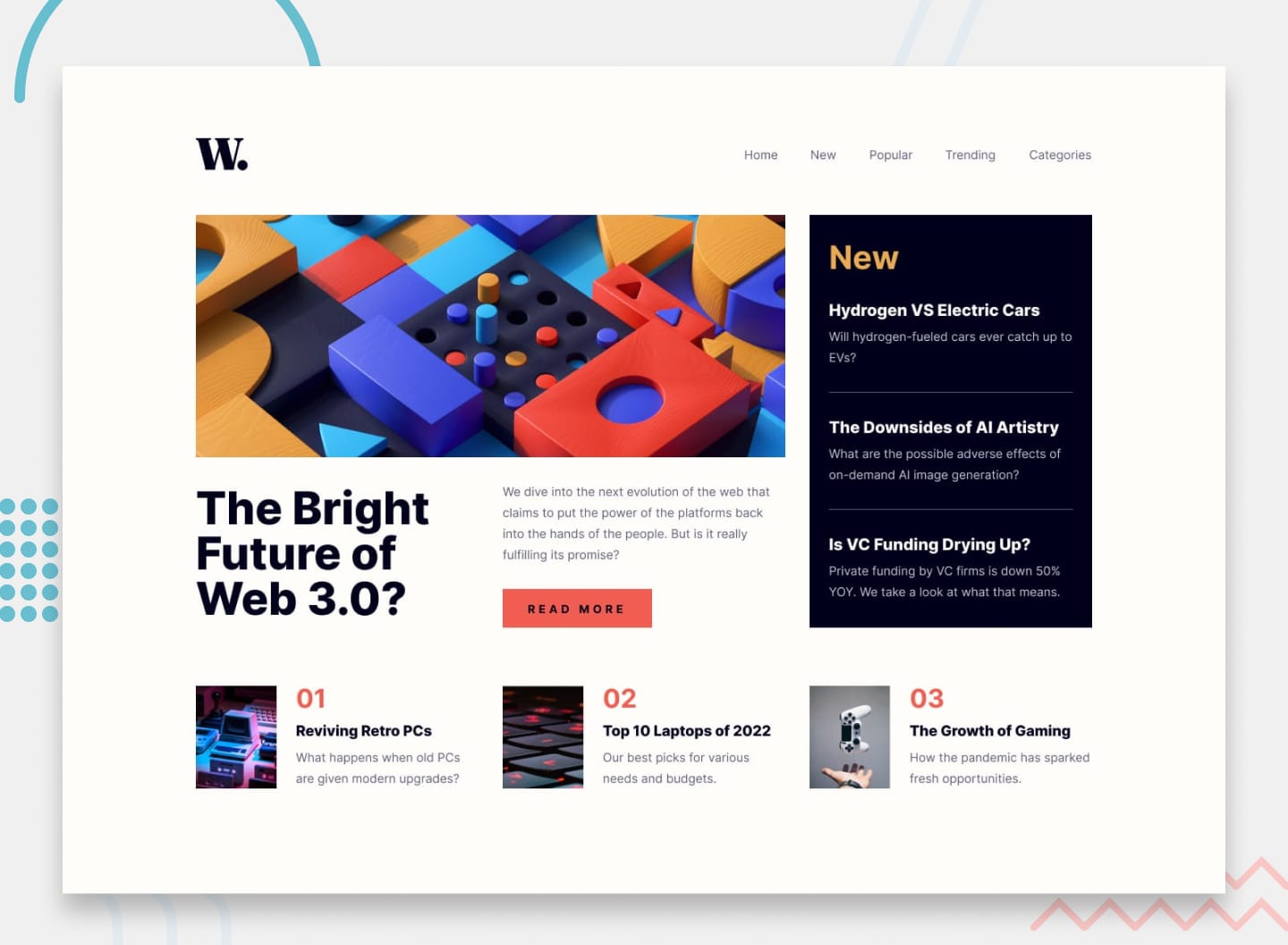
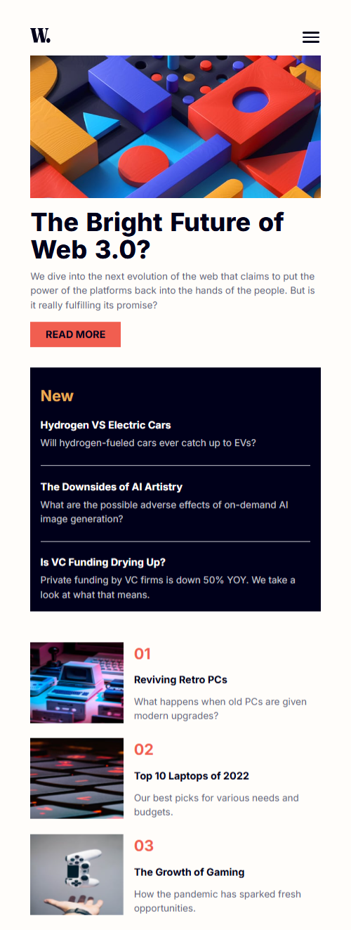
The News Homepage is a Frontend Mentor intermediate challenge — a responsive news layout with a sticky header, a sidebar for new articles, and a trending section. The main deliverable beyond the layout was a fully functional mobile navigation: a hamburger menu that opens a slide-in overlay, complete with a backdrop and smooth transitions. The constraint was vanilla HTML, CSS, and JavaScript only — no frameworks, no libraries.
My Approach
The core decision was to avoid the common pattern of writing two separate nav elements — one for desktop, one for the mobile overlay. That approach creates a maintenance liability: every link change has to happen in two places, and the two navs inevitably drift out of sync over time.
Instead, a single nav element was used for both contexts. On mobile, it becomes a fullscreen slide-in overlay using position: fixed, width: 75%, height: 100svh, and translate: 100% 0 to hide it off-screen to the right. On desktop, the same nav is reset to position: static inside the media query, dropping it back into the header's flex row as a normal inline navigation. One element, one source of truth, two completely different layout behaviours driven entirely by CSS.
The hamburger toggle was built with three span elements animating into an X on open — using translateY and rotate on the outer bars and opacity: 0 with scaleX(0) on the middle bar. The backdrop was implemented as a sibling element inside the header, toggled with an is-open class that transitions opacity from 0 to 1. JavaScript handled the class toggling, aria-expanded state, and document.body.style.overflow to lock scroll when the overlay is open — around 20 lines total.
Challenges
Stacking context and z-index conflicts were the most significant challenge. The backdrop was initially placed outside the header in the DOM, while the nav remained inside it. Despite the nav having a higher z-index than the backdrop, the backdrop was still rendering on top of the nav. The root cause was that position: sticky on the header was creating its own stacking context, trapping the nav's z-index within it. The nav's z-index: 300 was never competing against the backdrop at page level — it was scoped inside the header's context.
The fix was to place the backdrop inside the header as a sibling of the nav. With both elements in the same stacking context, z-index worked cleanly — nav at z-index: 300 beat backdrop at z-index: 200 without any ambiguity. This also reinforced a critical mental model: z-index is only meaningful between elements that share the same stacking context. DOM order and stacking context boundaries are the real deciding factors, not the numbers alone.
Desktop nav reset was a secondary challenge. Resetting position: static and inset: unset inside the media query was not enough — the mobile height: 100svh and width: 75% were still applying on desktop. inset: unset only resets positioning offsets (top, right, bottom, left), not dimensional properties. Explicitly adding height: auto and width: auto to the desktop override resolved it.
Hamburger bar inconsistency was a small but visible issue — the middle bar appeared thinner than the top and bottom ones. The cause was subpixel rendering: the bar height was set using a rem-based CSS custom property (0.15rem = 2.4px), and the browser rounded each bar's rendered height slightly differently depending on its position. Switching to an explicit 3px value gave the browser no ambiguity and rendered all three bars uniformly.
Tools Used