Preview
 Desktop
 Mobile
Overview
About This Project
The Brief
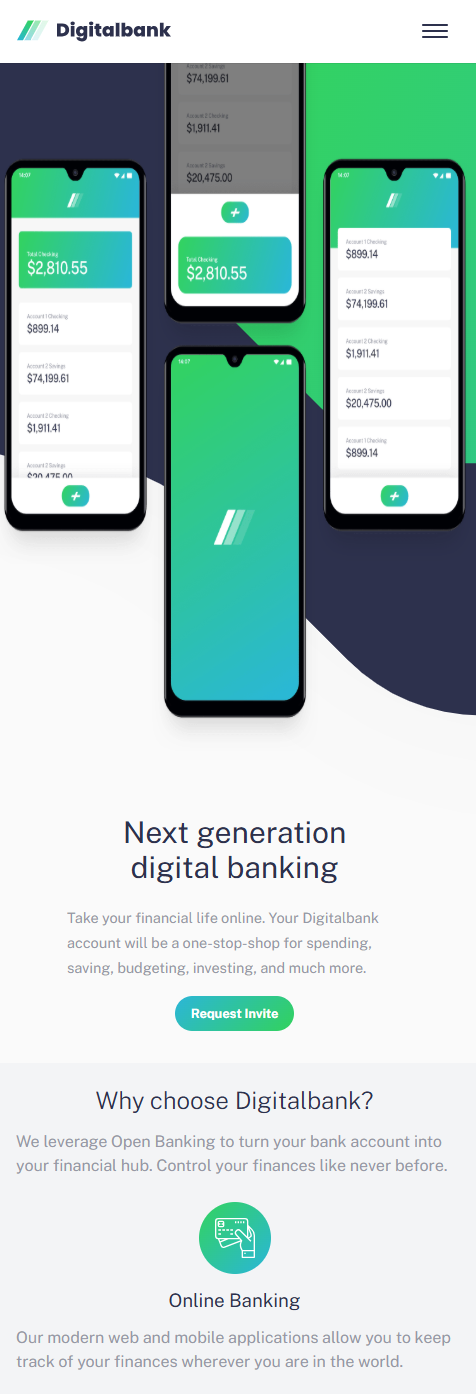
A landing page for a fictional digital banking product — designed to be clean, modern, and conversion-focused. The goal was to go beyond static markup and bring the page to life with meaningful interactions — a responsive mobile menu, scroll-based animations, and accessible navigation — using only HTML, CSS, and vanilla JavaScript.
My Approach
The project was built mobile-first throughout, with CSS base styles targeting small screens and desktop overrides applied inside min-width media queries. The hamburger menu was built with a dynamic clone approach — rather than maintaining a separate mobile nav in the HTML, the desktop nav is cloned into a mobile overlay at runtime, keeping the two always in sync. Scroll animations were implemented using the Intersection Observer API, triggering Animate.css classes only when elements entered the viewport rather than on page load. Smooth scrolling was wired up via event delegation on the nav, using href values as CSS selectors to target sections.
Challenges
Scroll animations firing on page load instead of on scroll. The initial approach hardcoded Animate.css classes directly in the HTML, meaning animations fired immediately regardless of scroll position. The fix was removing all animation classes from the HTML and using Intersection Observer to add them dynamically at the moment each element entered the viewport.
Offers section not animating on mobile. Observing .cards instead of the parent .offers section meant the observer target was too far down the DOM tree. Switching to .offers and tuning the threshold resolved the timing issue.
Article cards appearing static instead of animating individually. Observing the entire .article__wrapper on mobile meant one large element triggered a single animation above the visible scroll area. Switching to individual .article__card observation meant each card animated as it entered the viewport, creating a natural reveal effect as the user scrolled.
Stagger delays inconsistent across mobile and desktop. Using the callback's index parameter was unreliable — on desktop all four cards sometimes arrived in a single callback call, other times separately, making the delay unpredictable. The fix was using indexOf against the original NodeList to derive each card's true DOM position, giving a consistent and reliable stagger delay regardless of how the observer batched the entries.
Tools Used